Advisor Perspectives welcomes guest contributions. The views presented here do not necessarily represent those of Advisor Perspectives.
Every sector chart tells you where the crowd is. Almost none tell you the thing a stock picker actually needs to know: Inside a given sector, how much room is there to beat the average name?
Julius de Kempenaer's Relative Rotation Graph comes closer than most. It shows a whole universe of sectors at once, each measured against a common benchmark and plotted by how strong it is and whether that strength is building or fading. It depicts all 11 GICS sectors rotating clockwise through leading, weakening, lagging, and improving. It is a beautiful picture of the crowd.
What it does not show is where selection gets paid. The chart recalls the Boston Consulting Group (BCG) growth-share matrix from grad school, the four-box grid whose bubbles were sized by revenue. RRG keeps the four boxes but drops that size dimension, and it benchmarks against an index that says less than it could about selection. I added both back.
Where the Standard Chart Stops
The two axes of an RRG describe relative strength and the momentum of that relative strength. The second of those, the velocity of relative strength, is a close relative to the momentum factor that four-factor models reward.
The two are not identical, since this axis is a short-horizon rate of change rather than a 12-month ranking, but they rhyme: Both axes describe systematic, crowd-level dynamics rather than selection skill. They tell us where the crowd is and how fast it is moving, not how much room a stock picker has inside any one sector. That is the question for which I extended the analysis.
First, I substituted the equal-weight S&P 500, represented by the Invesco S&P 500 Equal Weight ETF (RSP), for the popular cap-weighted State Street SPDR S&P 500 ETF (SPY). Next, I added cross-sectional dispersion to measure alpha capacity, drawn from the S&P 500 members inside each sector.
Measuring Against the Average Stock
I chose RSP because every name counts the same, which makes it a clean proxy for the average stock, the hurdle that selection has to beat to earn alpha in our shop. A sector that looks strong only against cap-weighted SPY is mostly telling us that its largest few names are working, which is is more a fact of index concentration rather than an invitation to pick stocks.
Measuring against the equal-weight average strips that out and asks a more refined question: Is the sector beating the typical stock, or only the biggest ones? I find RSP gives a far cleaner look at how sectors move against the average stock, and it pairs naturally with a measure of selection opportunity.
The Second Change: Sizing Bubbles by Dispersion
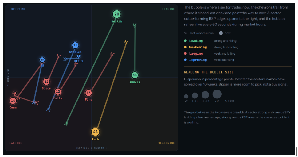
With RSP giving us a clean average, we add a second dimension by tying each bubble's size to the cross-sectional standard deviation of the sector's member-stock returns over the trailing ten weeks, expressed in percentage points. The wider that spread, the larger the bubble and the higher the numeric score shown inside (indicating higher alpha capacity.)
While dispersion is not a prediction, it does measure the size of the prize when the stocks inside a sector are chosen well. High dispersion means room for selection to pay, whereas a sector whose names all move together leaves nothing to disperse and nothing for a picker to capture.
Because the measure is backward-looking, the chart reports opportunity that has been present. That means a stock earns its place on the assumption that a sector's dispersion tends to carry from one week to the next rather than vanish overnight.
To be clear, neither a large bubble nor high relative strength is a buy signal. They tell us what is happening and whether there is room for selection to be rewarded — nothing more.
Like its forebear, our RRG extension is a GPS for market orientation in the fog of trading, and what we have built refreshes every 60 seconds while the market is open. While there is no crystal ball, a good GPS is grounding when conditions are shifting. We find that happens often enough to maintain tools for exactly those moments.
Reading the 2 Together
With relative strength on the horizontal axis, the momentum of that strength on the vertical, and dispersion in the size of the bubble, the chart resolves into four readable setups. The vertical position tells us whether the sector is moving into that setup or out of it, which is the timing the rotation was built to show.
Strong relative strength and wide dispersion is the cleanest setup a stock picker gets. The sector is running ahead of the average stock, and its names are spread far enough apart that picking the right ones matters. Call it a tailwind with room to make it pay when a manager selects well. In the graph above, from June 23, 2026, health care sat there, leading in relative strength and widely dispersed.
Strong relative strength with tight dispersion tells us the sector is working, but its names move as one, which leaves little for selection to add. We are mostly capturing the sector’s systematic move, and that may be unavoidable, and even desirable, for diversification.
Weak relative strength with wide dispersion is the double-edged sword. A wide bubble in a lagging sector is either defensive alpha or a falling knife, and the bubble is large either way. As a result, any interpretation demands caution. Technology sat in this zone on June 23, 2026, wide and weakening.
Weak relative strength with tight dispersion is the quiet quadrant, little working in its favor and little room to pick within it. As with the others, it is a description for orientation, not a prediction.
Drawing Conclusions
Without certainty, we manage risk with tools, experience, and the discipline to read information well. The tool we have built separates beta influences from alpha opportunity. It orients users to the two questions that matter most to our active book: how much the sector is helping or hurting through its systematic, market-driven move; and how much room there is to add alpha by selecting inside it. The first we can rent cheaply. The second is the only place skill gets paid.
In our operational cockpit, we watch a streamlined version of this alongside the portfolios as an orientation check rather than a trade trigger.
The version described here is published, and updated throughout the week, at https://lul-lc.com/rotation/.
The market will always tell you where it has been. The most an honest chart can do is show you, clearly, where you are standing, while where to go is the adventure.
Note: The quadrant method is adapted from Relative Rotation Graphs (RRG), created by Julius de Kempenaer. The equal-weight default, the breadth read, the dispersion-as-size encoding, and the last-close-to-now convention are our own. The tool measures dispersion across each sector’s recognized S&P 500 constituents, a proxy for name-level opportunity rather than a complete investable set. Not affiliated with or endorsed by the originators of RRG. Nothing here is investment advice.
Mark Tennenbaum is the founder and chief investment officer of Life UnLocked Partners, a California-registered investment adviser, and chief executive of Leyland Cypress. He began his post-MBA career on Wall Street, designing derivatives and cross-border M&A. Later, he served as chief financial officer of one of Los Angeles’s first commercial datacenters and of SoftAware Networks, and co-founded a messaging-security firm acquired by Microsoft in 2005. His research on measuring active manager skill is under peer review at the Journal of Portfolio Management.
A message from Advisor Perspectives and VettaFi: Discover something new! Click here to register for our upcoming webcasts
Read more articles by Mark Tennenbaum
 Advisor Perspectives welcomes guest contributions. The views presented here do not necessarily represent those of Advisor Perspectives.